Design Notes
An Interview with Sonya Dyakova
The designer of Donald Judd, Artworks: 1970–1994 on process and her holy grails
By Ha Duong

Name: Sonya Dyakova
Title: Founder and Creative Director
Studio/Firm: Atelier Dyakova, founded in 2011
Based in: London
Notable Projects: David Lynch’s Nudes (2017) and Digital Nudes (2021), Lemaire digital design and branding (ongoing), The Noma Guide to Fermentation (2018), Donald Judd (2019), Sarah Sze: De nuit en jour (2020), Leilah Babirye (2021)
Born in Siberian Russia and later transplanted to San Francisco, the graphic designer Sonya Dyakova grew up in a creative environment: at home, shelves were stocked with books on visual art, architecture, and history, and early memories of her parents involved, say, discussions of El Lissitzky’s technique of photomontage. Her parents, who were architects, and her grandmother, who was an art teacher, exposed her to the world of thinking and communicating complex ideas through visual language—alongside an extended family of tailors, seamstresses, photographers, and sculptors.
Today, Dyakova runs the award-winning Atelier Dyakova, and her impressive resume includes stints at Vince Frost, Kerr|Noble, Phaidon Press (with the late Alan Fletcher), and Frieze, where she redesigned both their flagship magazine and Frieze Masters magazine. She has since worked on an eclectic array of projects, including an ongoing collaboration with Lemaire, the famed Scandinavian restaurant Noma, and a never-ending list of books for artists ranging from the photographer Nobuyashi Araki to David Lynch and the painter Paula Rego.
On the eve of the publication of our latest book, Donald Judd, Artworks: 1970-1994, a sleek volume documenting the acclaimed 2020 David Zwirner exhibition curated by Judd Foundation artistic director Flavin Judd, we chatted with Dyakova about her creative influences, favorite art books, and design process.

Let’s start with something simple. What chair are you sitting on?
A very comfortable one! (An ergonomic chair by Humanscale.)
What are your graphic design holy grails?
Scale and white space: They’re interrelated. White space should be activated to make something look dynamic. When I was in college, my typography tutor Cheri Gray had us do an exercise where she put up a flip chart and asked us to put a mark on the page. Immediately, questions came up: where should it be, what should it be, how much space should it take? The designer’s job is to work with these questions of placement. Oftentimes when a design doesn't look right, it’s because white space is not respected.
Whose work influences your design practice?
Andrei Tarkovsky is an incredible cinematographer. I cannot say enough about his films. In Sculpting in Time (1984), he writes about the conditions of creativity and the role of the artist—that if the ideal conditions for making art existed, there would be no art. There are no such things as ideal conditions. It will always be difficult; life is difficult! The artist has to create something beautiful or meaningful despite all that. The tension between reality and the divine—what you wish for—is what art is. Don’t wait for perfect conditions to work!
There’s a scene from the film Nostalghia (1983), where the main character decides to walk through the length of a swimming pool while holding a candle, without blowing it out. It’s just so surreal; it’s a gentle yet defiant act of faith. Tarkovsky created iconic images. He was concerned with conveying the inner world of his characters more than the plot or storyline.
When I was younger, I read a book by Le Corbusier from the ’70s that belonged to my father. The book discusses how people use the city, and funnily enough, right now, we are working with the architecture gallery Archizoom that’s dealing with exactly these questions: about city planning, the role of the metropolis, how the city should be, how we can interpret a city, and how we can rethink living in a city. Things Corbusier was certainly concerned with as an architect. I also think it’s important how Corbusier used simple, accessible language to describe his ideas.
There’s a book that came out recently by the Design Museum tied to their exhibition on Charlotte Perriand. Knowing about her work is inspiring as a working woman; I quite often wonder how she managed to do all this back then. I bought a set of lights designed by her, and it’s such a joy to have a piece of design in your home knowing that it is designed by a female creative.

What’s something you adore for its design that’s not perceived as “design”?
Recently for a project, we were looking at ancient amulets. They were really simple yet very soulful and powerful.
How do you get started on a new project?
We use language in our work as a starting point. Before we visualize anything, we should be able to talk about something and try to reach some logic or solution just by thinking about it, without doing anything, without necessarily looking at anything.
Without InDesign or any other design tools, you can make a rational link in your mind using words or language. Of course when you start to work on it and visuals come into play, you may discover something else or come up with different ideas. But I think having language and words as a starting point is a very solid way of making something logical, and then it’s easy to explain to the client how you arrived at that solution and also makes it more difficult for them to pick apart because it’s based on a thought, an idea. Then, we try to find a way to express these qualities through image editing, typography, material, and colors, fine tuning the balance of the elements with each other as we go along.

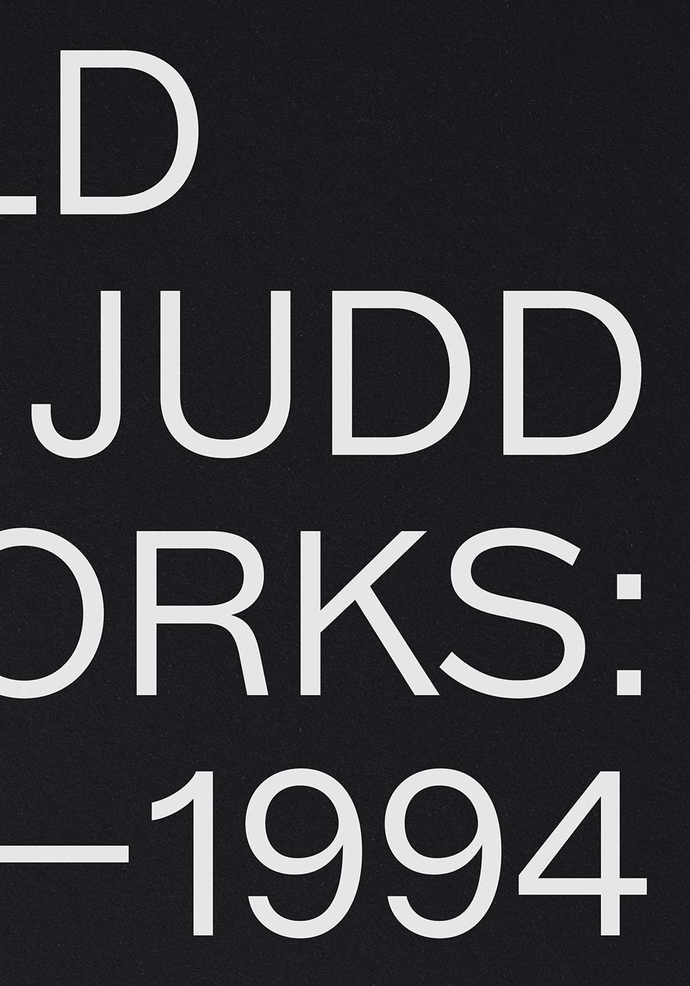
You recently designed a book for us. Could you walk us through it?
The design for the Judd book was very much a collaboration between the studio and Flavin Judd, who came to us with a really strong vision. I art directed and oversaw the project, and our designer Tom Baber was the dedicated designer of the book. Flavin wanted the type on the cover to wrap around the book, exploring the book as a three-dimensional object rather than type on a flat page.
We chose a no-frills, utilitarian typeface, whose style was born out of the hot metal typesetting period, reflecting Judd’s use of industrial sheet metal fabricators to produce his work. The font is a contemporary interpretation of a 19th/ 20th century American font by Swiss foundry ABC Dinamo. As well as being from a similar time period and location to Judd, the font is conveniently named Marfa—a perfect fit for the project! We wanted something that was super American [Note: The typeface Marfa is inspired by early American gothic typefaces]. This is something really important for us, to get the origins of references right. Even though it wouldn’t be completely transparent to an outside reader, it definitely gives the right impression. We pay attention to the typography because letterforms have hidden messages inside.
What I really like about the book is how, when you’re only seeing its spine, it still looks like a strong graphic. Even though you can’t read what it says, it somehow communicates something very beautiful. When you open the book, you can read the entire book title on the front and back cover. The book’s black edge makes everything streamlined so, again, the fact that there are very simple lines suggests a connection to Judd’s work. The design is really thinking about the book as an object: How can we make the book communicate or suggest something about the work itself?

What are your favorite art books?
Wild Flowers is a small, tactile book by Alan Fletcher, who I worked with at Phaidon. It’s a jewel on my bookshelf. It’s very unassuming. The book uses textured paper, with its title embossed so small you can hardly see it—you can only feel it. Inside are his effortless watercolor drawings of flowers, where he just let the ink grow.
Recently I bought this book for my husband as a Christmas present: Cigarettes (2012) by Irving Penn, published by Hamiltons. It’s absolutely stunning: the way that it’s printed, the pictures, the whole idea. It’s a series of pictures of used cigarette butts—basically rubbish, litter. And he photographed it in such a way that something like that becomes sublime.
The Principles of Uncertainty (2009) by Maira Kalman is a wonderfully illustrated, personal, and touching book. Her mind meanders; it’s not in a straight line, for sure. Her way of making a book is as if she’s telling you some stories, and then goes to another story, and then thinks of something else. It’s very interwoven, and I really love to read it, even with my daughter who is only eleven. We come across names of people or historical facts that we don’t know about, and we Google them together.
The Sophie Calle (2003) book is something we look to often in the studio for reference. It was connected to an exhibition at the Pompidou many years ago. In this book, there’s so much material and many different page treatments. Sometimes the text is big, sometimes it’s small, sometimes it’s pink paper—it’s a huge mixture of material. There are lots of inserts, so a bit like Maira Kalman, but done in a different way. Putting so much varied information together is really difficult to do in a good way. The book feels like it never ends, you always get surprised as you turn the page. Éditions Xavier Barral [the publisher] makes really excellent books.
The last book is one I bought recently when I went to the Rodin exhibition at the Tate. After some searching, I found this book, also by Éditions Xavier Barral and photographed by Emmanuel Berry. The photography is so beautiful. The way you photograph something can make a huge difference to the object. It's really exquisitely done, very sensitive to visual space and how the works are photographed against dark, dense, black. To print such rich black takes skill.

What are some of the most well-designed things, objects, exhibitions, etc. you’ve seen in the past year?
The Rodin at the Tate that I mentioned already was quite a moving experience because I was able to have time alone with it—I didn't have my kids with me!—so it was really nice.
The Paula Rego exhibition, first at the Tate, and later at Victoria Miro was also really mind blowing. I knew about her work, but for the first time I was able to see so many works in one space. To see the scale and to see them up close was really powerful. I knew already that we would be working with her for Victoria Miro when I saw the show, so that made it more relevant—I was really paying attention to the symbolism she was using. I didn't realize until I saw the exhibition how political Paula is. Through doing that book, I learned a lot about her background. This is one of my favorite parts of working on a project: you really get to learn something new.
What’s your dream project?
We had, or almost had, our dream project. Session One, a book on Issey Miyake’s work, with photography by James Mollison. It was a dream project in the sense that Miyake’s process resonates with us very strongly, anchored in craftsmanship, materiality, making and traditional techniques. He draws influences from the Jōmon period (Japanese prehistory), when Japan was inhabited by a hunter-gatherer and foraging culture, which reached a considerable degree of sedentism and cultural complexity. The term “Jōmon” means “rope-patterned,” describing the patterns pressed into the clay. Session One relates to the first ancestral Japanese people. It was fascinating to uncover all these complexities, and we approached the book design with these influences in mind. We proposed, for example, to work with tree bark paper that has natural irregularities and coarse texture. Bark paper has waves that echo the Session One fabric. Unfortunately, the book was part of a planned show in Tokyo, postponed due to the pandemic, and is currently on hold. ●
Featured images, from top: The shelves of Atelier Dyakova. © Toby Glanville; interior spread of Sarah Sze: De nuit en jour (Fondation Cartier, 2020). © Ed Park; Sonya Dyakova working with a colleague in her studio. © Toby Glanville. Courtesy Atelier Dyakova. Following featured image: Donald Judd, Artworks: 1970–1994 (David Zwirner Books, 2022). Photos by Kyle Knodell. Further featured images: Archizoom exhibition poster by Atelier Dyakova; Leilah Babirye (Stephen Friedman Gallery, 2021). © Ed Park. Courtesy Atelier Dyakova
Further reading
Virginia Woolf and Vanessa Bell: A Portrait of the Sisters as Young Artists
The story of how Woolf's sister, an often overlooked artist, became her lifelong creative muse and rival.
A Reader's Guide to (Almost) Every Book Painted by Liu Ye
A rundown of the artist’s many, many book paintings—from erotic fiction, literary classics, Bauhaus books, and Dick Bruna’s Miffy.